Thursday, August 28, 2014

Wednesday, August 27, 2014

Citrus Twist Kits - layout process tutorial

Today I am giving you a tutorial that was bloggedon the Citrus Twist Kits blog yesterday, a little step by step tutorial of how I make my layouts. Here using the August Main kit and Embellishment kit and some pieces of 6x6 papers from the PLKit. (paper doily from my own stash)

First the finished layout.

CTK August Main Kit tutorial Aug 26th Christin G 18


I always start with a white cardstock. When I get my kits I often make small minikits for each layout picking out the papers and the embellishments I want to use for each layout. I don't always end up using all the pieces, but I try to boost the creativity by giving me some extra time to plan.  I don't like mixing colors too much, but I want some contrast in my layouts. I made mini kits for all my four layouts this month the same way.

CTK August Main Kit tutorial Aug 26th Christin G 01 

Next step: backgrounds. Since it takes a while for my backgrounds to dry I like to make them in bulks. I pick out the mists and mediums I want for each layout and make them at the same time.

These are the mists I chose for this layout.

CTK August Main Kit tutorial Aug 26th Christin G 02 
I always use clear gesso and not white gesso when I make my backgrounds and for several reasons. I use ordinary white Bazzill as I like the structure and color of it and white gesso looks yellow on the white cardstock,  the white gesso is also very smooth and it feels like the mists will run off, the clear gesso is mucher rougher when you touch it and I feel works better with the mists.  To spread out the clear gesso I use a long ruler to get it even and no lumps.

CTK August Main Kit tutorial Aug 26th Christin G 04 
I wrote earlier that I often make backgrounds in bulk, the same goes with layering. I don't use my heat gun to hurry up the drying time. In stead I start cutting the layouts roughly how I want it.  Notice how I don't use anything else beside my scissors.  It just feels better and I can see better when I cut.  My thoughts about layering is that nothing has to be precise, quite opposite, it feels stiff when it gets too linear.   I cut some pieces bigger and some smaller. And as long as you add mulitple layers it doesn't really matter how you layer them, it can't go wrong...


CTK August Main Kit tutorial Aug 26th Christin G 05 

After I cut everything I test layer it on a piece of white cardstock, to see if I need more layers or not. Notice that the finished layout didn't look exactly like this....

CTK August Main Kit tutorial Aug 26th Christin G 06 

Now my clear gesso has dried up and it's time to start playing with the mists. I like to get a watercolor feeling, without working with the real thing.   I add a little water to my cardstock and start dropping mists, Ecoline or similar mediums,. Then I use a waterbrush or brush with water to spread out the color.

CTK August Main Kit tutorial Aug 26th Christin G 07 

To avoid bulky cardstock and too heavy color I use babywipes and/or paper towels to remove water. 

CTK August Main Kit tutorial Aug 26th Christin G 08 

After all the colors have dried I add more dimension to the page by adding layers of stenciling and layers with stamps. All to ease the transition between the layers of paper and cardstock.

CTK August Main Kit tutorial Aug 26th Christin G 09
Here is the finished background. I end up cover most of it, but it doesn't matter, you can see some of it.  I work with layers on the coloring. When I drop the mist in water it acts like when water is freezing and spreads out in similar pattern.  You have to let it completely dry before you add drops of mists that you DON'T want spreading out and only look like small drops...

CTK August Main Kit tutorial Aug 26th Christin G 10
After finishing the background it's time to go back to my layers of paper.  When I am happy with the layers I either staple the papers together or to the white cardstock, allowing me to stick pieces of papers and stickers between the layers with ease.

CTK August Main Kit tutorial Aug 26th Christin G 11
CTK August Main Kit tutorial Aug 26th Christin G 12
Here is the finished layout againCTK August Main Kit tutorial Aug 26th Christin G 18And some closeups. 
CTK August Main Kit tutorial Aug 26th Christin G 13CTK August Main Kit tutorial Aug 26th Christin G 14

CTK August Main Kit tutorial Aug 26th Christin G 15
CTK August Main Kit tutorial Aug 26th Christin G 16CTK August Main Kit tutorial Aug 26th Christin G 17

Monday, August 25, 2014

Diva

Played with some new Shimelle papers from American Crafts this weekend and used some Crate Paper as well, including the black/white frame.


Sunday, August 24, 2014

Life is beautiful

Have more summer layouts. Have used Fancy Pants Designs Me-ology collection. The transparent title is from Heidi Swapp.


Saturday, August 23, 2014

Featured in Fancy Pants Emag

I am so proud and excited to be featured in the August Fancy Pants Designs Craft as the winner of the July Sketch Challenge. You can see my layouts from page 16.  You can see layouts from lots of different collections from the last months.


If you don't get the Newsletter, feel free to download the emag here.

Thursday, August 21, 2014

Project Life i Norge gjestedesigner #3

Dette er mitt tredje innlegg som gjest hos Project Life i Norge og har klippet hele innlegget derfra. I morgen kommer nytt innlegg der.

Jeg fortsetter med å ha mye luft og hvitt og har ikke overdrevet med dekorasjoner - det overlater jeg mer til mine layouter.

I min bloggrunde i dag fant jeg en tutorial på Tim Holtz sine sider med en teknikk på hvordan man kan lage fine resist og vannfargekort. Jeg anbefaler dere å ta en titt. Jeg har i stedet valgt å gjøre motsatt av dette og i stedet for å embosse for å få resistteknikk har jeg tatt en pensel og fargelagt kortet og så embosset over - litt enklere...

Jeg blandet vann og mist først.


Jeg forsøkte meg med både med hvit og med gullembossingpulver og ble mest fornøyd med gull.


Det finnes mange fine maler å få kjøpt for å sy på papir, jeg har tatt en litt enklere løsning - søkte på stitching + scrapbook og fikk opp noen egentlig dårlige kopier. men det er nok for å kunne lage hull. 


Har brukt brodertråd - 3 tråder - kan kanskje med fordel reduseres..


Her er ferdige resultatet


Wednesday, August 20, 2014

Prinsessen og frosken

Sharing another layout made with the collections Save the Date and Daily Stories from Teresa Collins.

"Princess" Anea is dancing with her frog....


Tuesday, August 19, 2014

Adding dimension to your layouts - Inzpira magazine

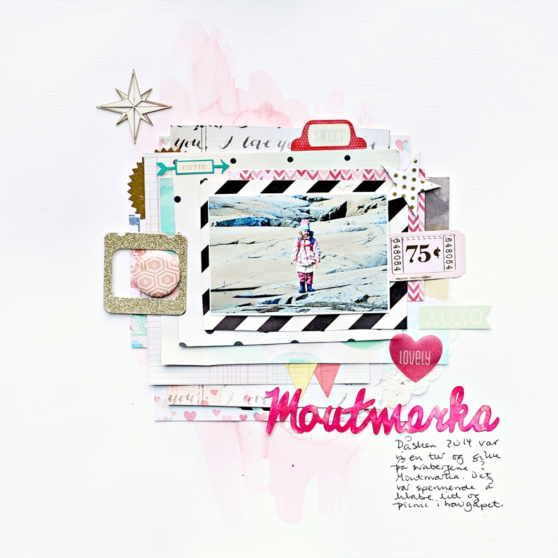
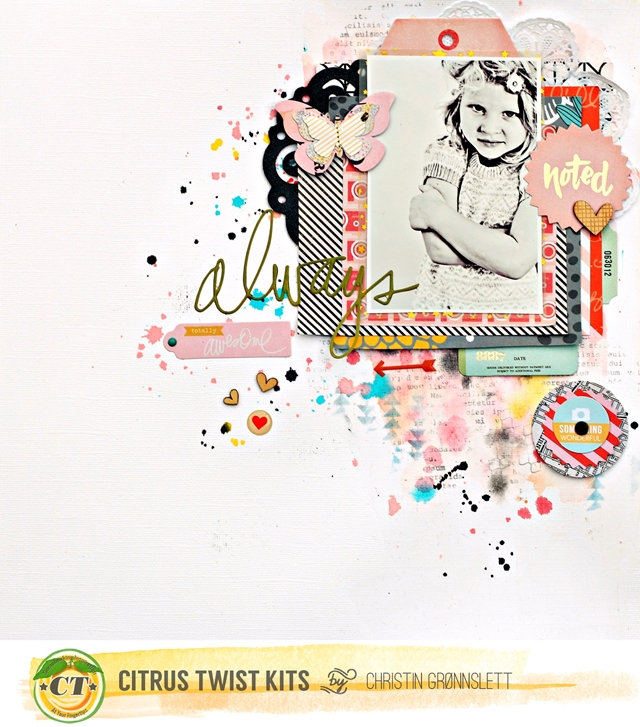
I was very proud to be a covergirl of the July Issue of Inzpira magazine. After getting some ideas on FB I made this tutorial for this layout.


I will here show you a couple of tips on how I work with layers to make dimension.
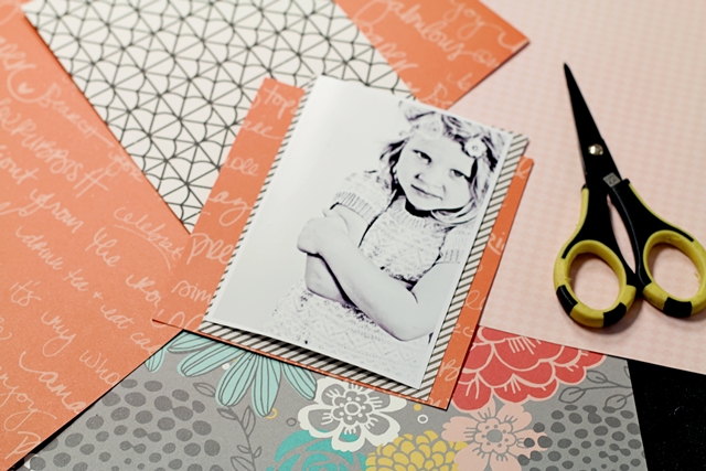
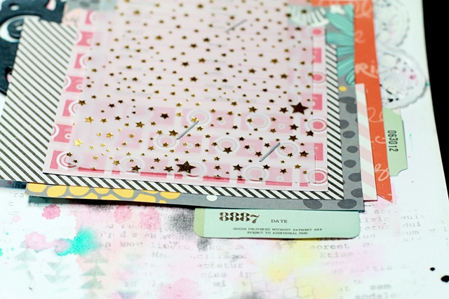
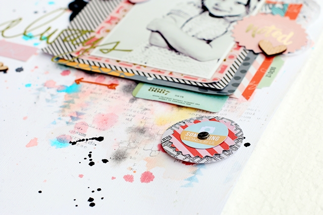
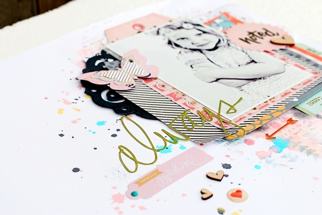
For my layers of paper I chose just a few colors, white, grey/black, aqua/teal and yellow. I don’t like mixing too many colors when I work with a black and white photo. I actually don’t use a cutting machine when I cut the layers for my layout. Since I work with a lot of layers it feels good to not be forced to be accurate and precise when I work, the lack of straight lines is what’s adding some of the dimension.


First you cut your papers in the sizes you want – make some smaller than your picture and some larger. The more layers you choose – the less it matters how you cut your layers. When just working with a white cardstock – I feel like the transition between the patterned papers and the white cardstock is too hard, so I like to add some color. So I like to add both a softer transition and more dimension and structure to my page.


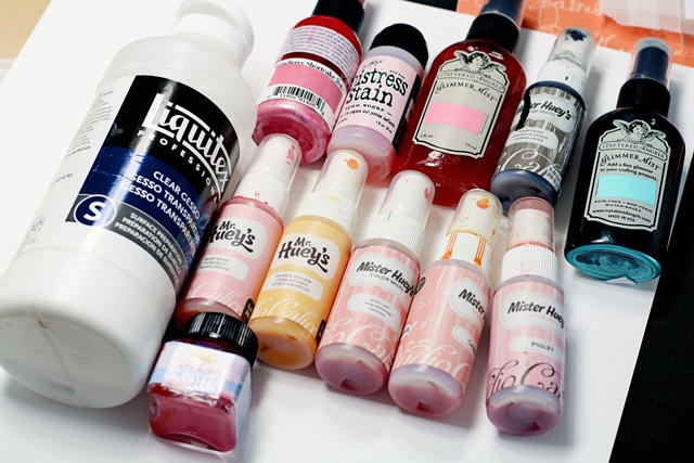
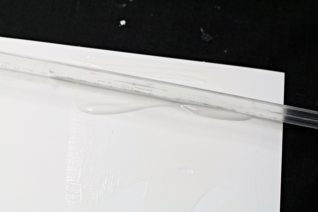
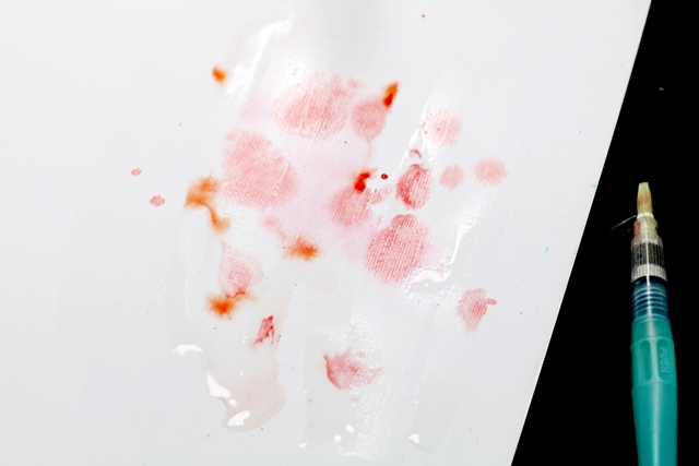
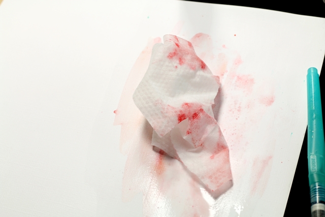
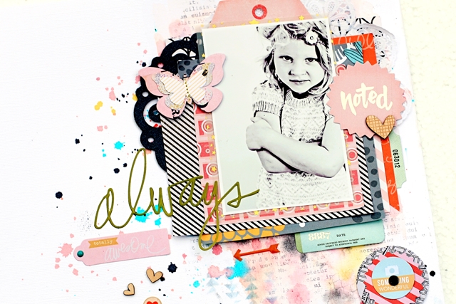
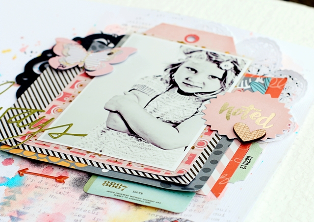
Here I have used the same layers, just added color, I started up with white cardstock. You might ask why, but for me it’s the best way to showcase the photo by giving the layers and the picture some air around so you can rest your eyes. I then make add colors to my cardstock, I usually work with mists to create a watercolor effect. I start with a base of clear gesso and add drops of mist together with water.


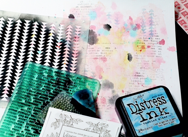
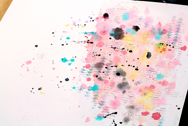
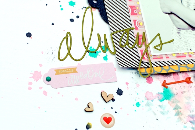
The colors on the cardstock eases up the transition between the layers and the cardstock, but I want to add more dimesion. Then I usually add distress ink with stencils and for the top layers I add drops of mist and stamp with different stamps. I often drop the mist in different colors – either picking up some of the colors in the photo or in the papers. Some of the same reason why I have a white cardstock for my base goes for the reason why I use grey/black for the added layers of stencils/stamps. They make for great contrast. If you feel like your background is to hard colored - add a layer of white gesso together with stencils – that will soften the background a little.
For a watercolor tutorial you can see in the June issue of Inzpira magazine.


There are several ways to add even more dimensions to you layers – which I will not show here but you can try for yourself. You can spray your papers with water – crunch them- then layer your paper- staple them together and use a heater to dry the papers. The papers will stay in the shape you put them. This style is great if you have a style where you love to distress the papers.
Another way of adding dimension to your papers is by just crunching them, but not adding water. You will get some dimension, but you layers will not be super thick. Again I chose to staple the layers only in the middle so it doesn’t get flat on the sides.
If you don’t like to crunch your paper so much the best way is just to add more layers, BUT you could bend the corner on the layers a little. It’s not much, but it makes a difference.

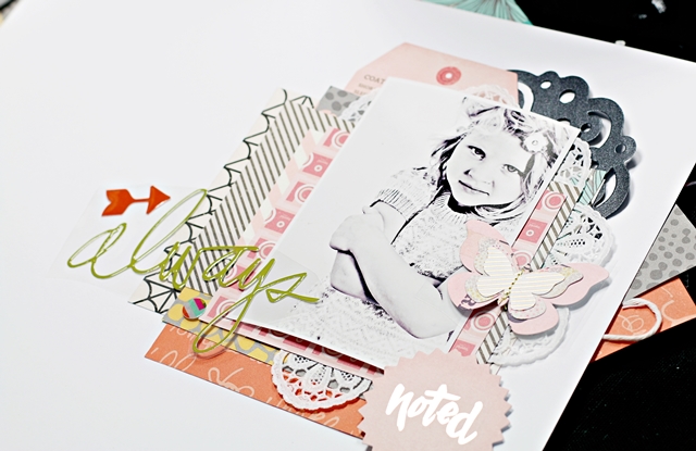
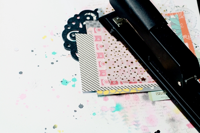
When I have chosen my layers, stapled them together, I am not really finished. If you leave your layers this way it will sometimes look like it’s lacking something. The layers may look a little hard on top of each other.


Then it’s a good idea to add small borders in between the layers of paper – or stickers, tabs or anything. I love to use ribbons or a border punch for this. This you can do also after you have added your photo(s). It’s also a good idea to use a white border on your papers – that way they don’t drown in your layers. Then add embellishments than pop up. That can be thickers, chipboard or anything that doesn’t just lie flat on the paper.
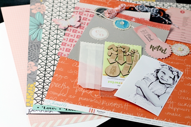


Material &  Tools
Cardstock: Bazzill Basics – White
Patterned papers: Fancy Pants Design – Superp, Awe-Inzoring, Enchanted, What a Wonderful Day Strip; My Minds Eye – Sweet, Amy Tangerine Plus One 6x6 paper pad
Stamps: Wycinanka, Sodalicious, Denim Tampons, KaiserCraft
Paints, inks & effects: Liquitex – clear gesso; Tattered Angels – Trunk Bay, Turquoise blue, Sea glass, Patina; Studio Calico Mr Huey – Sky, Buttercup, Leaf Green, Warm Calico; Shimmerz – Jeni B Bleu; Versafine stamp pad – Black, Smoked Grey; Distress Ink – Black soot
Embellishments: Echo Park Paper – stickers; American Crafts – thickers; Pink Paislee – tag; Jenni Bowlin – tab; Simple Stories– tabs; bag, flair, chipboard heart, tags
Tools: Ek Success – large scallop Border punch, Crafters Workshop stencils – Tiny Rings Bits, Stacked Triangles, Chevron, Triangle, Herringbone; Kelley Purkey stencils – Triangles
Other: Vellum

Monday, August 18, 2014

Cuteness

We went to a small and lovely beach called Villa Malla a few times this summer. First we had lunch with a nice buffet and then the kids took a swim.

Have mixed up a few different Heidi Swapp collections here to match Aneas bathing suit.